Before any model is fit, any test is run, or any conclusion is drawn, a good analyst does one thing first: looks at the data. Exploratory data analysis (EDA) is the structured process of getting to know a data set — its shape, its problems, its surprises — before committing to any formal statistical method. Skipping this step is one of the most common ways serious analysis goes wrong, not because the later math is done incorrectly, but because it's applied to data that was never properly understood in the first place.
- Why EDA comes before formal modelling, not after
- The core EDA toolkit: summary statistics, histograms, scatter plots, and box plots
- How to spot missing data, outliers, and data-entry errors before they corrupt an analysis
- How EDA findings should shape which formal statistical method you choose next
What EDA Actually Does
John Tukey, the statistician who coined the term in the 1970s, framed EDA as detective work rather than confirmatory testing — you're looking for patterns, generating hypotheses, and spotting problems, not yet trying to prove anything formally. This is a genuinely different mindset from hypothesis testing, where you commit to a specific question and test procedure in advance. EDA comes first and is deliberately open-ended; formal inference comes after, once you actually understand what you're working with.
EDA sits at the very start of the broader data visualization workflow and is the direct predecessor to every formal statistical technique covered elsewhere on this site — treat it as the mandatory first phase of any real analysis, not an optional nicety to skip when time is short.
Step One: Summarize Before You Visualize
Every EDA process starts with basic descriptive statistics — mean, median, standard deviation, min, max, and quartiles for every numeric column; counts and proportions for every categorical one. This sounds almost too simple to be useful, but it catches an enormous number of real problems immediately: a "percentage" column with a maximum of 150, an "age" column with a minimum of −4, or a categorical column with fifty different spellings of the same underlying value are all things a five-second summary table reveals instantly, long before any sophisticated technique would.
Step Two: Visualize Distributions
A histogram reveals a numeric variable's shape at a glance — is it roughly symmetric, or skewed? Does it have one peak, or several (suggesting mixed subgroups)? A box plot compresses the same information into the five-number summary (min, Q1, median, Q3, max) and flags potential outliers directly, making it especially good for comparing the same variable across several categories side by side.
These aren't redundant with the summary statistics from Step One — they show you the shape a table of numbers can hide. Famously, several data sets with identical means, variances, and correlations (the "Datasaurus Dozen" is a well-known modern example) look completely different when actually plotted — one is a smooth cloud, another spells out a dinosaur. Summary statistics alone would never reveal this; a scatter plot would immediately.
Step Three: Visualize Relationships
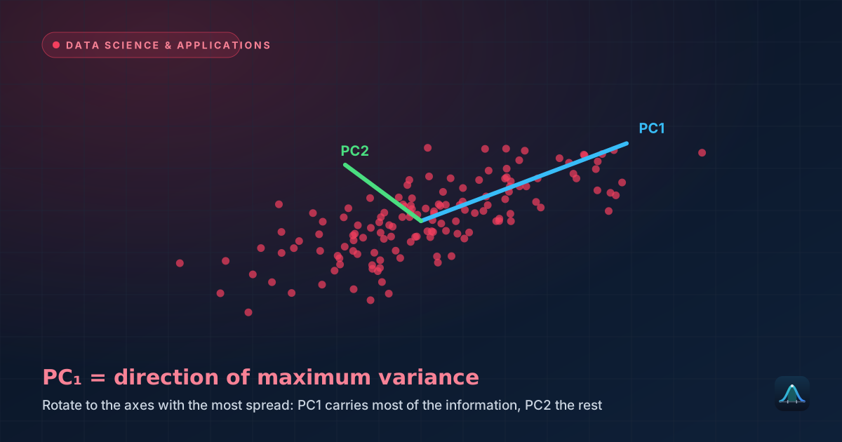
A scatter plot is the default tool for examining the relationship between two numeric variables — revealing linear trends, curved relationships, clusters, or a complete lack of pattern, and making outliers in a bivariate relationship visible in a way that looking at each variable separately never would. A point that's entirely unremarkable on both variables individually (a normal height, a normal weight) can still be a striking outlier in the relationship between them (a normal height paired with an unusually low weight for that height).
Step Four: Hunt for Missing Values, Outliers, and Errors
This is arguably the most consequential part of EDA, precisely because it's the part most tempting to skip. Missing values need a deliberate decision — are they missing completely at random, or is there a pattern (survey respondents skipping an income question more often at certain income levels, for instance)? Ignoring this and simply deleting incomplete rows can silently bias an analysis if the missingness itself isn't random.
Outliers need individual judgment, not automatic removal. A genuine data-entry error (a height recorded as 1800cm instead of 180cm) should be corrected or removed. A genuine, real extreme value (an actual Olympic athlete's actual extreme performance) usually shouldn't be — removing real data because it's inconvenient for your analysis is a serious methodological error, sometimes called "cleaning until it confesses."
1) Check data types match expectations (is "age" actually stored as a number, not text?). 2) Check ranges against real-world plausibility. 3) Count missing values per column and look for patterns in where they occur. 4) Plot distributions of every key variable. 5) Plot relationships between variables central to your research question. 6) Check for duplicate rows. This list takes minutes to run through on most data sets and routinely catches problems that would otherwise surface much later, at a far more expensive stage of analysis.
How EDA Findings Should Change Your Next Steps
EDA isn't just due diligence — its findings should genuinely redirect the formal analysis that follows. A histogram revealing strong skew might mean a median-based summary or a transformation (like a log transform) is more appropriate than reporting a raw mean. A scatter plot revealing a clearly curved, non-linear relationship rules out simple linear regression as the right modelling tool before you've wasted time fitting one. Bimodal distributions suggest a hidden grouping variable is worth investigating rather than analyzing the data as one undifferentiated population. In each case, EDA is what tells you which formal method actually fits the data, rather than defaulting to whichever method you happen to know best.
Normality Checks as Part of EDA
Many common statistical methods (t-tests, ANOVA, linear regression's residuals) carry a normality assumption. EDA is where this gets checked — visually with a histogram or a Q-Q plot (which plots your data's quantiles against a theoretical normal distribution's quantiles; a straight diagonal line indicates good normality, systematic curves indicate departures), and formally with a normality test like Shapiro-Wilk for a numeric verdict alongside the visual one. Running a formal test after visual inspection, not instead of it, gives the most reliable overall picture — visual inspection catches shape problems a single test statistic can miss, and the formal test adds a quantified check on a judgment call that pure eyeballing leaves ambiguous.
Common Tools Used for EDA
In practice, EDA is almost always done with software rather than by hand, given how quickly it needs to iterate across many variables and plots. Python's pandas library (for summary tables and data manipulation) combined with matplotlib or seaborn (for visualization) is the dominant open-source combination; R's tidyverse ecosystem, especially ggplot2, is a close equivalent widely used in academic and research settings. Spreadsheet software like Excel remains genuinely useful for smaller data sets and quick first-pass exploration, particularly for analysts without a programming background — the underlying EDA principles apply identically regardless of which tool executes them.
EDA in Practice: A Short Worked Scenario
A retailer wants to understand what drives customer order value before building a predictive model. EDA reveals: order values are heavily right-skewed (most orders are small, a few are very large — informing a decision to log-transform the target variable before modelling); a scatter plot against customer tenure shows a weak positive trend with several extreme outliers, on inspection all traced to a small number of wholesale business accounts mixed into what was meant to be a retail-customer data set; and 4% of rows have a missing "region" field, concentrated almost entirely among online-only orders rather than distributed randomly, suggesting the field is only collected for in-store purchases. None of these findings required a single formal statistical test — all three came from step one through four of ordinary EDA, and each one materially changes how the eventual model should be built.
What's the difference between EDA and data cleaning?
How long should EDA take, relative to the rest of an analysis?
Is EDA only for large, messy data sets?
Should I remove every outlier I find during EDA?
Share this article
Written by
Statistics Fundamentals Editorial Team
Written and reviewed by our team of statistics educators. Content is aligned with GCSE, A-Level, AP Statistics, and undergraduate curricula.
About Statistics Fundamentals →